Congratulations!
After spending hours cleaning, sorting, and categorising data - you found some valuable insights. But, here is a catch: How do you make sense of this huge pile of numbers and facts?
Enters-
Data Visualisation.
Put simply, data visualisation is a powerful tool for transforming complex data into clear, understandable visuals. With visualisation, you can convert your findings into engaging charts, maps, and graphs, making them easily comprehensible for all.
Whether you are a pro in the data field or a beginner, data visualisation makes it easier to communicate your findings effectively.
Each day we generate approximately 328.77 million terabytes of data (source: explodingtopics.com). But until you clean, filter, and sort the information, you cannot extract the real value. This is where data visualisation comes in handy.
Data visualisation simply implies representing data visually. Instead of staring at columns of numbers or endless rows of data, you convert your findings into charts, graphs, and diagrams. It's like turning data into a story that's easier to understand.
Data visualisation concepts make complex information accessible. With these techniques, any organisation can spot patterns in a matter of seconds and make informed decisions.

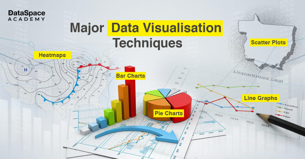
When it comes to visualising data effectively, there are several techniques at your disposal. Here are the
different types of visualisation techniques frequently used by analysts:
Hotter colours (reds and oranges) indicate higher values, while cooler colours (blues and greens) represent lower values.

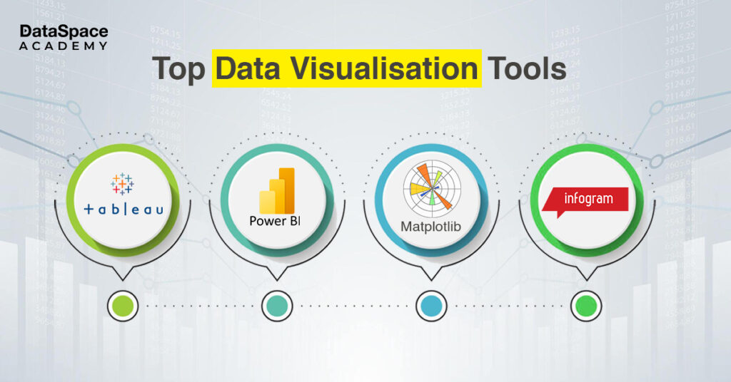
Here are four popular options for creating the most effective data visualisation:
Data visualisation is crucial for data analysis. It helps you understand complex data, identify trends, and communicate insights effectively. With approximately 328.77 million terabytes of data generated daily, you need
data visualisation techniques and tools to uncover actionable insights from them.
DataSpace Academy’s
Data Analytics Certification Course has a dedicated module on data visualisation. Here you learn about PowerBI, Tableau (Public Version), and Data Storytelling. Do you want to know more about data visualisation? Check out our blog on Data Visualisation and its Overview, Types, and advantages.

 When it comes to visualising data effectively, there are several techniques at your disposal. Here are the different types of visualisation techniques frequently used by analysts:
 Here are four popular options for creating the most effective data visualisation:
